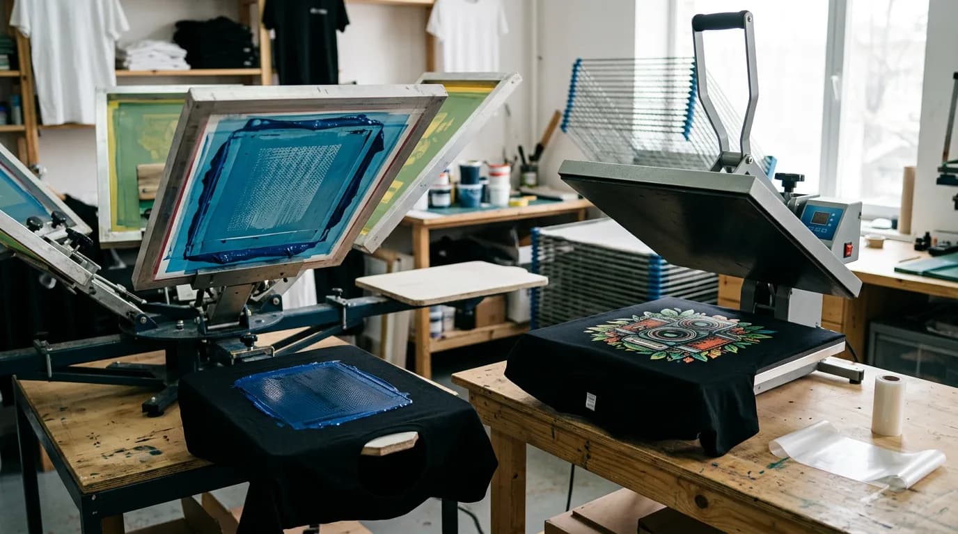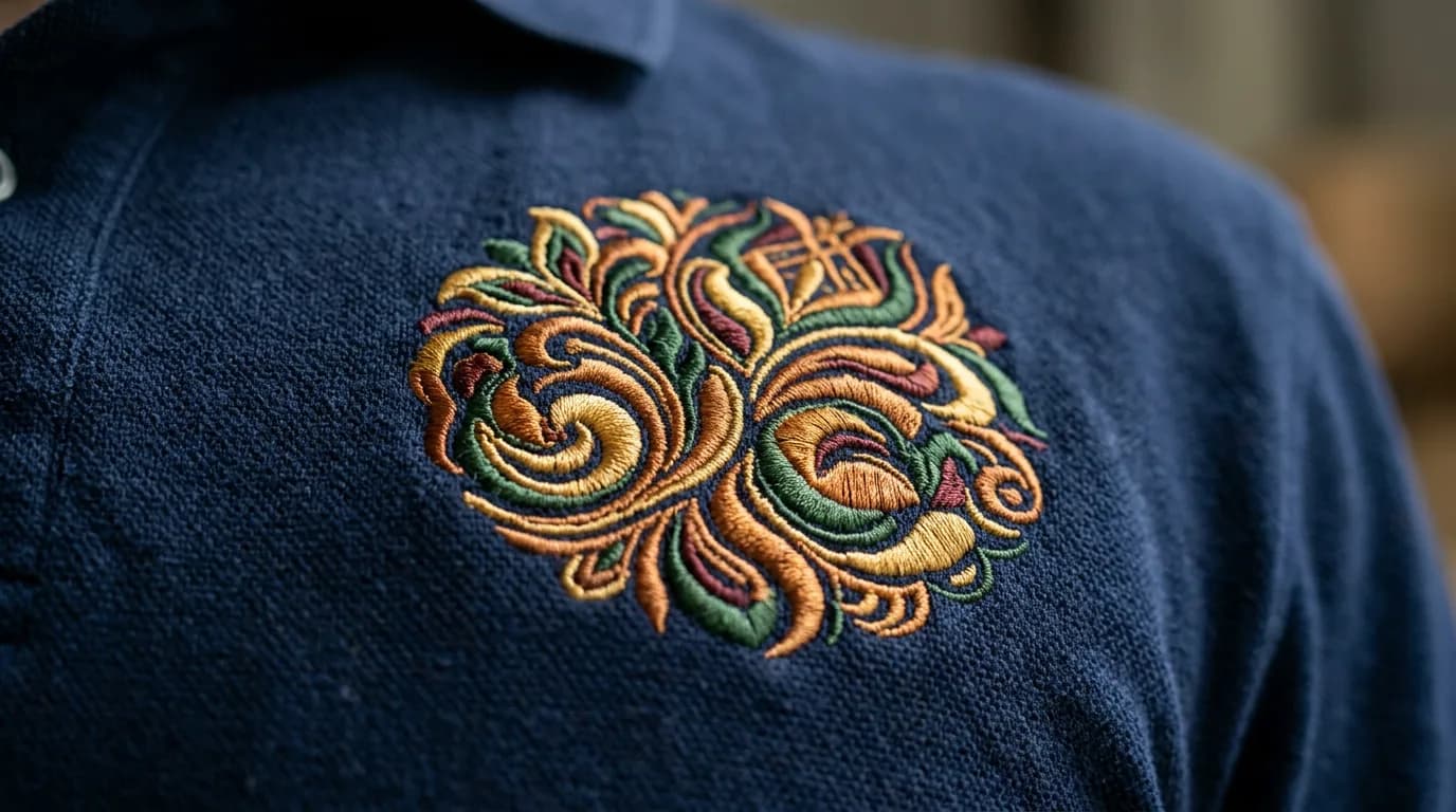

People choose the shirt color first and the artwork second, then wonder why the result looks flatter than the mock-up. The garment is not a background — it is the largest color in the design, and it changes everything sitting on top of it.
Contrast does more work than color choice
A design reads from across a room because of the difference in lightness between the artwork and the garment, not because of the hue. Navy on black is a sophisticated palette and an unreadable shirt. Squint at the mock-up: if the design smears into the garment, the contrast is too low, and no amount of ink or thread fixes it.

What happens on dark garments
- Printed color sits on a white underbase, so it stays bright rather than sinking into the fabric. Colors can read very slightly cooler than on screen.
- Thread does not need an underbase, but thin lines on a dark ground lose definition faster than you expect. Go a little heavier.
- Anything with a soft edge or a drop shadow will show where the underbase ends. Solid shapes are more forgiving.
Combinations that usually disappoint
| Combination | Why it struggles | Better |
|---|---|---|
| Navy on black | Almost no lightness difference | White, gold or a mid grey |
| Yellow on white | Yellow is very light already | Outline it, or go to a darker garment |
| Red on maroon | Same family, no separation | Cream, or a much lighter red |
| Grey on heather grey | The heather texture eats the edges | Black, white, or a saturated accent |
| Pastel on pastel | Pretty on screen, invisible at 10 feet | Keep one of the two dark |
A note on heather and texture
Heathers, slubs and tri-blends are lovely garments and slightly harder surfaces. The fleck in the fabric shows through fine detail and softens edges. It suits a distressed or vintage look enormously well and fights a crisp corporate mark. Choose deliberately rather than by accident.
If it does not read at ten feet, it does not read. That is the whole test.