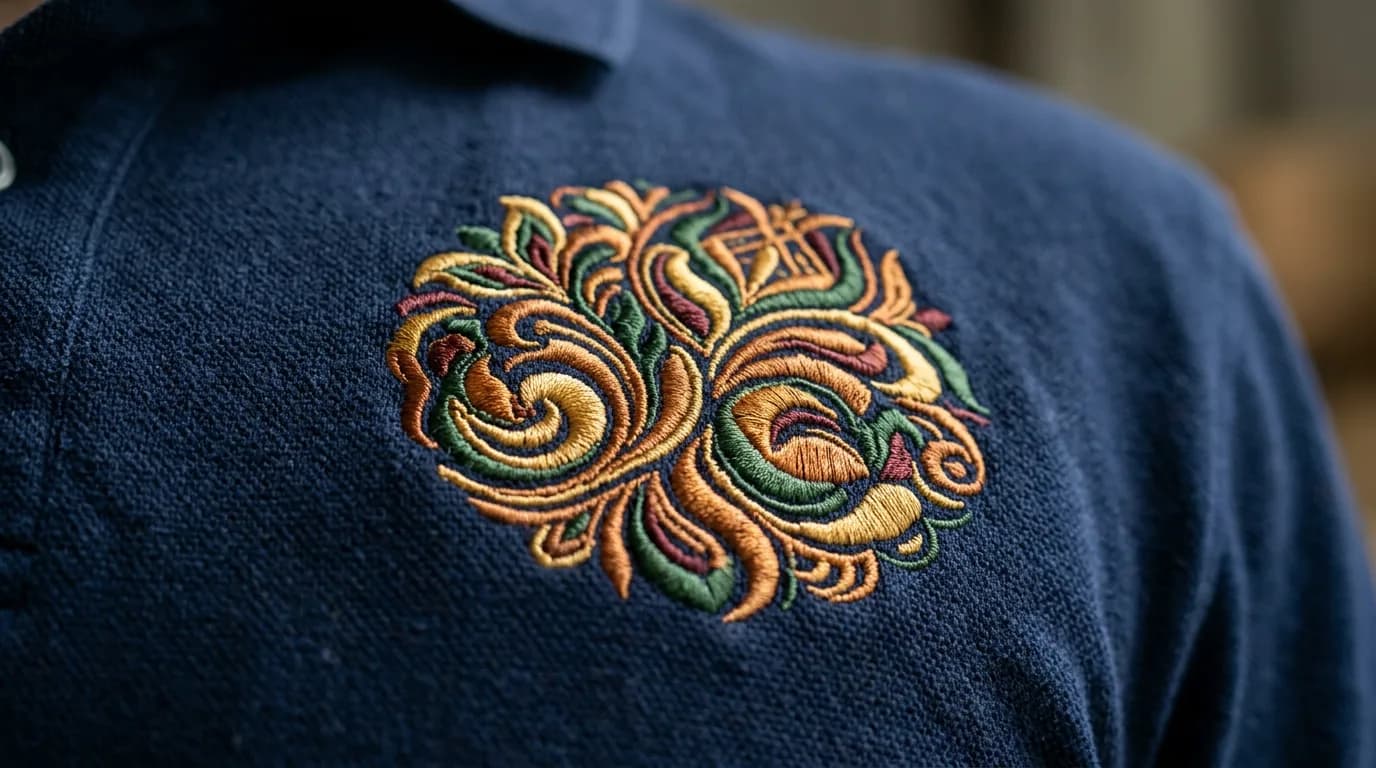
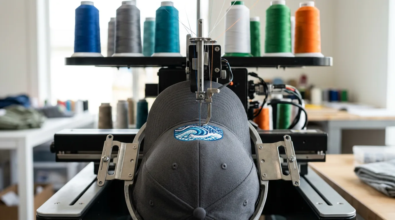
Caps are the single most common place a design gets rejected, and it surprises people because the same logo sews perfectly on a shirt. The difference is that a cap is stitched on a curved, structured surface with a seam running up the middle of the front panel, and the machine works outward from the center rather than flat.
The three constraints
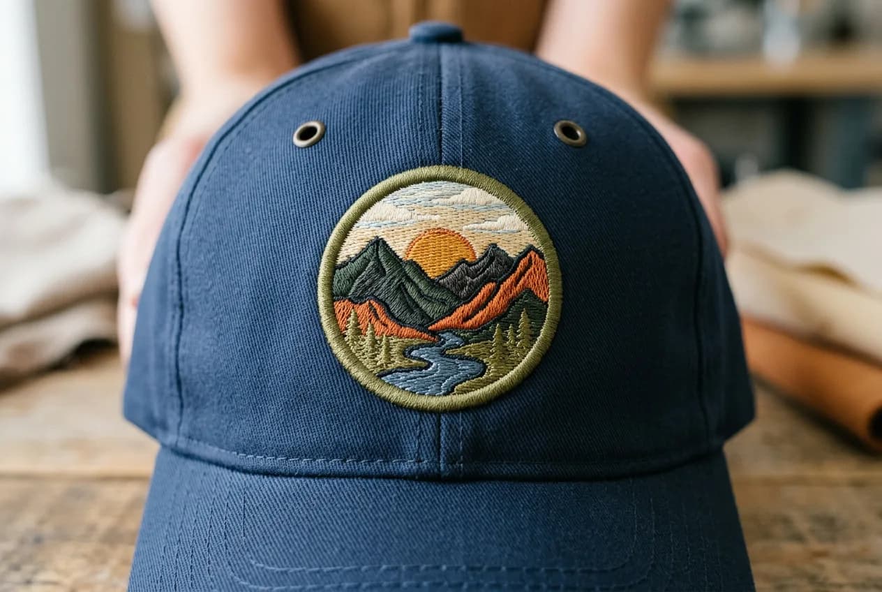
- The center seam. On a structured six-panel cap there is a seam directly up the middle of the front. Fine detail landing on it will distort. Designs that straddle it need to be simple and bold.
- The height. The usable front panel is around 2.25 inches tall on a standard cap. Tall or stacked designs run out of room fast.
- The buckram. Structured caps have a stiffener behind the front panel. It supports the stitching, which is why structured caps sew better than unstructured ones.
What to change about the design
| Problem | Why | Fix |
|---|---|---|
| Small text under the logo | Below 5 mm it closes up on a curve | Drop it, or move it to the side panel |
| Tall stacked lockup | Runs past the 2.25 in panel | Use the horizontal version |
| Thin outline detail | Distorts across the seam | Thicken to at least 1.2 mm |
| Large solid fill | Heavy and stiff on a cap front | Open it up, or move to twill appliqué |
Why we usually say no to printing caps
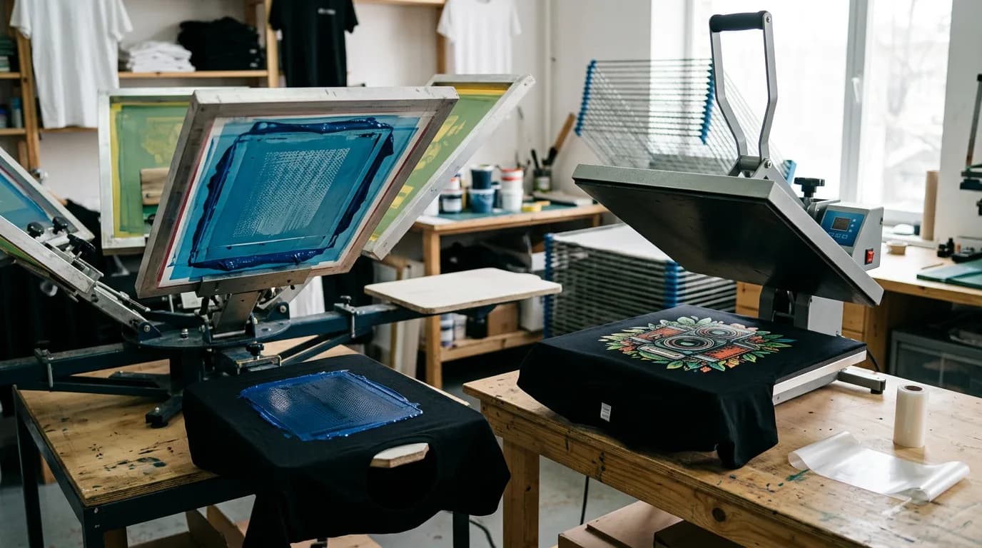
A heat press needs a flat surface and even pressure. A cap gives you neither, and while cap platens exist they only reach the flattest part of the front panel. For anything that has to survive being worn daily, embroidery on a cap is the more reliable answer — which is why caps are the clearest case in the whole shop where thread simply wins.
If the logo needs its tagline to make sense, a cap is the wrong place for it.